


With Mehfil, BigSpoon had a vision of making Biryani attractive for the new age audience. The complete design solution that was formulated resonated with this vision, and helped Mehfil craft a powerful brand story and experience delivered through branding & packaging.
The brand was created keeping in mind the gap between the existing biryani brands in the market. An in-depth study of the category, culture, consumer and competition helped us gain insights and arrive at a suitable personality for the brand. The challenge was to portray the brand as a perfect blend of authenticity and modernity.
BRAND IDENTITY:
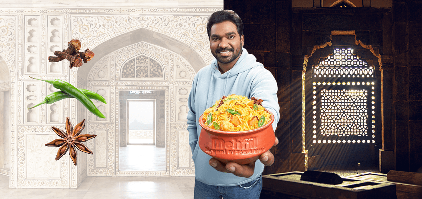
Inspiration: The brand identity was crafted keeping in mind the traditional roots of biryani and the Mughal-inspired architecture & aesthetics.
Typography: The sans-serif type has a defined character and stylization that suits the brand. The subtle arc-like features makes Mehfil unique in its own nature.
Color: The chosen colors for the identity White & Yellow stand in strong contrast against the background thus helping it to grab consumer’s attention.
Dynamic Logo: The changing spices add interest to the identity and communicate the product story. The spice element and biryani were kept in Yellow to showcase the relation between flavor and food.


PACKAGING GRAPHICS
Formats & Approach: Being in the takeaway food category, Mefil had two different packaging formats through which the delicious food was being delivered. Conceptualizing a systemic approach to the packaging graphic design thus became crucial. A scalable system was created through a play of various graphical elements for the front of the pack.
Visual Elements: Flat vector illustrations of a ‘heart’ were created to portray Zakir’s love story combined with multiple illustrations of spices. These were further complemented with hashtags and typography that are relevant to the brand and enhance the experience of the consumer while opening the box to reveal the food inside.
Colors: The colors for the packaging were chosen carefully keeping in mind the food category and the young & quirky aspect about the brand. The packaging revealed different layers of colors on different surfaces creating a contrast and building a visually impactful experience for the consumers. We began with a strong red shade, known to be a food color and increasing appetite, contrasted with a teal for the side surfaces. When the inner box is opened, a splash of blue creates a good contrast and brings across the entire modernity of the brand. The presence of different shades of Orange, Red, Green, Yellow & Blue all across the box were inspired by the colorful dish that Biryani is and the assortment of spices that it presents.


